Building an analytics product from day zero, purposefully evolving it as we uncovered how people actually experienced their work
I joined GobbleCube when the product itself remained undefined. The underlying tension was fascinating: quick-commerce companies possessed an abundance of data, yet fundamentally failed to grasp what was breaking or how to intervene. Designing GobbleCube meant crafting a faster, deeply intentional path to clarity for diverse human users, completely rejecting the expectation that every person must operate like a trained data analyst.
- Company
- www.gobblecube.ai
- Duration
- 3+ years (present)
- Role
- Product design lead
- Day Zero
- 3 Founders, a few engineers and analysts, 2 designers, no PMs
- Today
- 150+ people, 6 designers, multiple PMs and others
GobbleCube deals with enormous amounts of data. The design problem was never simply how to display it - it was how to help someone find the few things that actually needed their attention.
My role stretched well beyond designing features, especially in the first two years when we had no PMs. I worked across product thinking, design strategy, data, systems and eventually building the design team itself.
Shaped core analytics
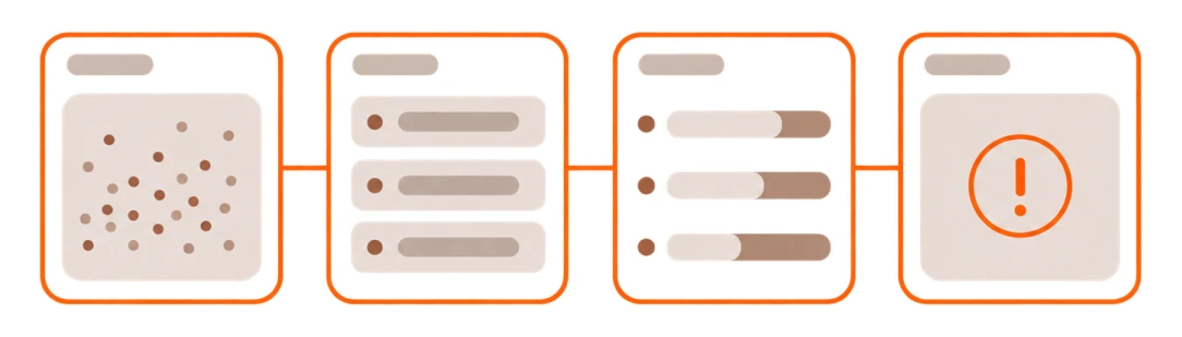
Transformed scattered experiments into a definitive analytics experience, enabling brands to pinpoint failures and unearth root causes.
Introduced Swimlanes
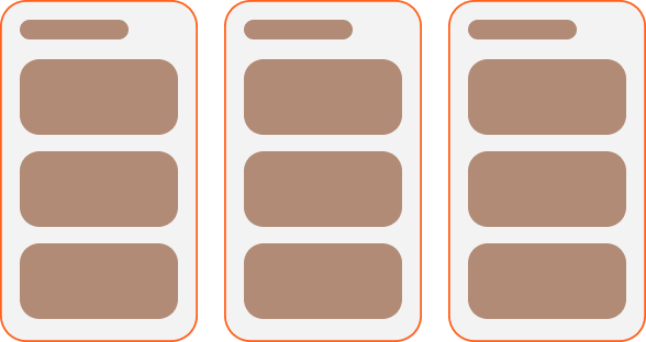
Invented a visual framework to contrast massive datasets, establishing it as the fundamental mental model driving the entire product.
Part designer, part PM
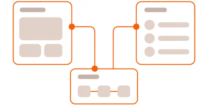
I didn’t just draw screens. I dictated product logic, governed quality, and directly engineered the core roadmap.
Systemized 100+ reports
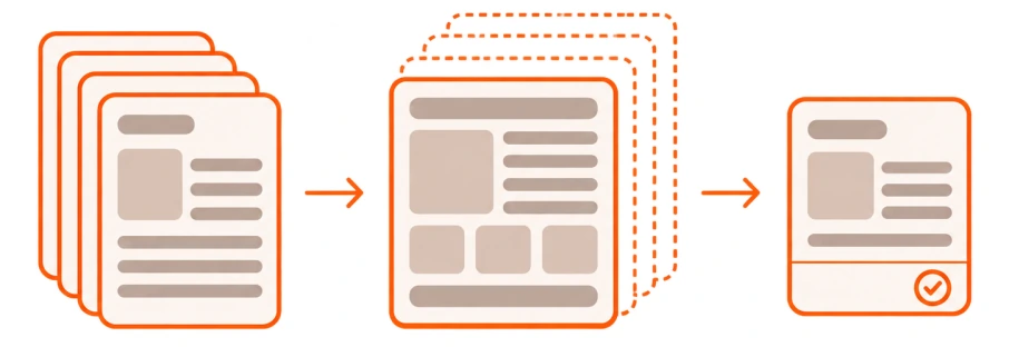
Architected the design system powering over a hundred strategic reports, eventually leveraging AI to automate repetitive workflows.
Built a data-informed practice
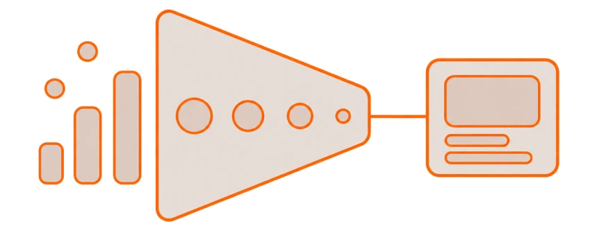
Examined funnels, friction points, and power user habits to inject purpose into our product trajectory and design choices.
Worked across new directions
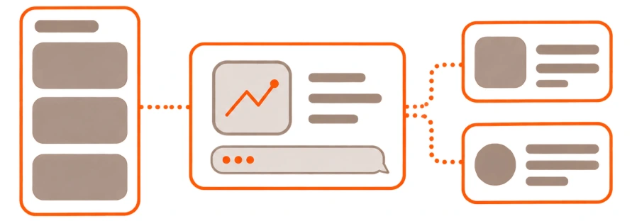
Directed design across mobile, self-serve, and AI agents, ensuring every fragmented piece advanced the unified product vision.
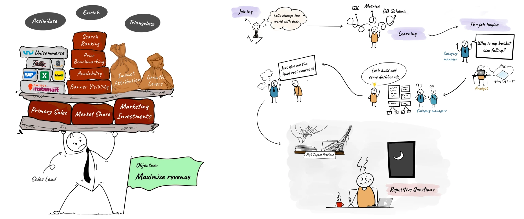
Brands selling on quick commerce already had data but getting an answer to a question like “Why did my sales drop?” could move from a category manager to an analyst, through spreadsheets or BI tools, and take anywhere from two days to two weeks to resolve. The founders knew the domain deeply. What we didn’t yet know was what the right product interaction should be.Our first hypothesis was chat. Let users simply ask the data what was happening. We built an early what + why experience, but quickly realised that an empty input field still expected users to know exactly what to ask.The interaction removed the dashboard. It didn’t remove the cognitive work.
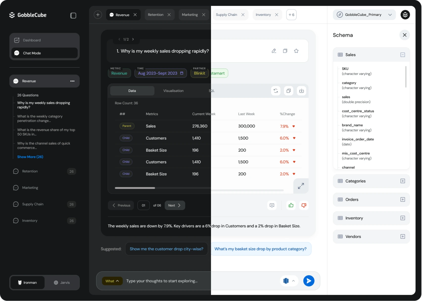
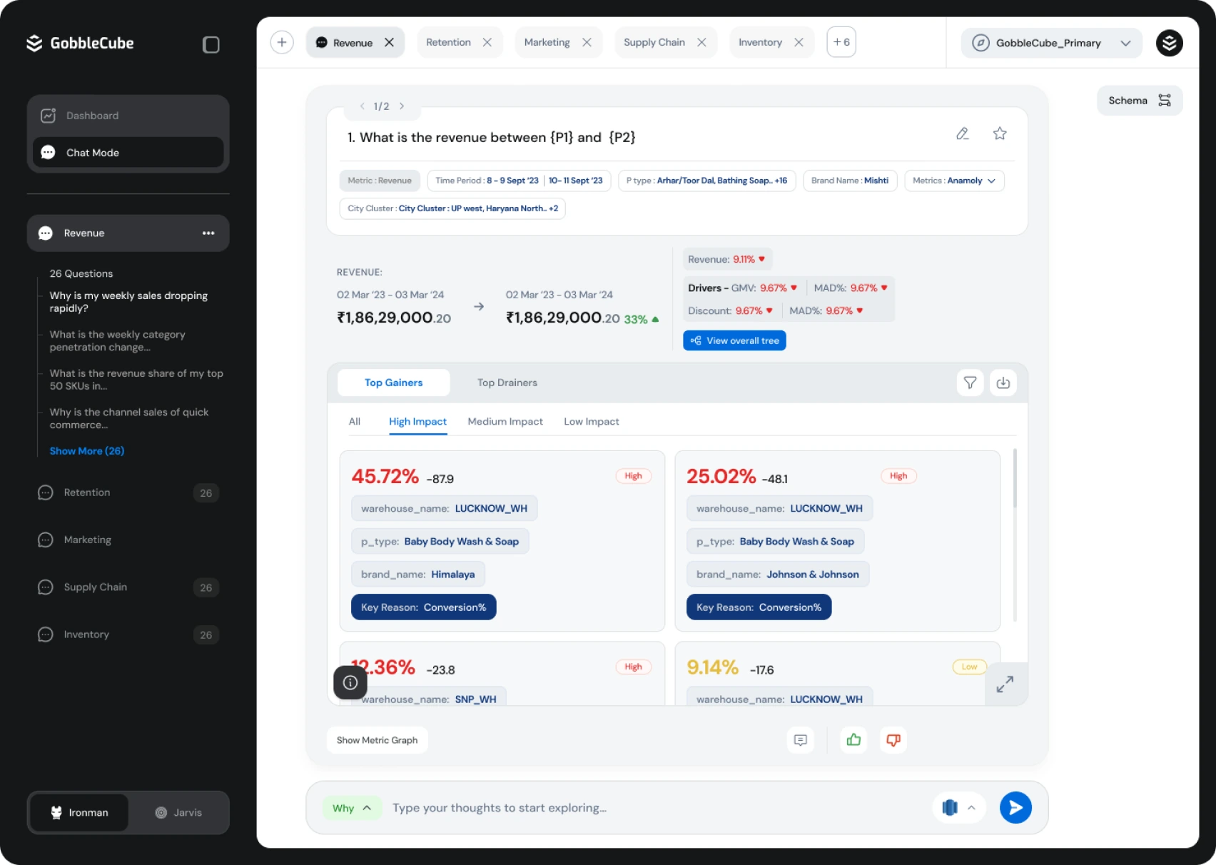
We dropped the direction within a month and moved towards something more guided. It became an early lesson I kept coming back to: new technology isn’t useful just because it gives people more possibilities. Sometimes good design means giving them fewer.
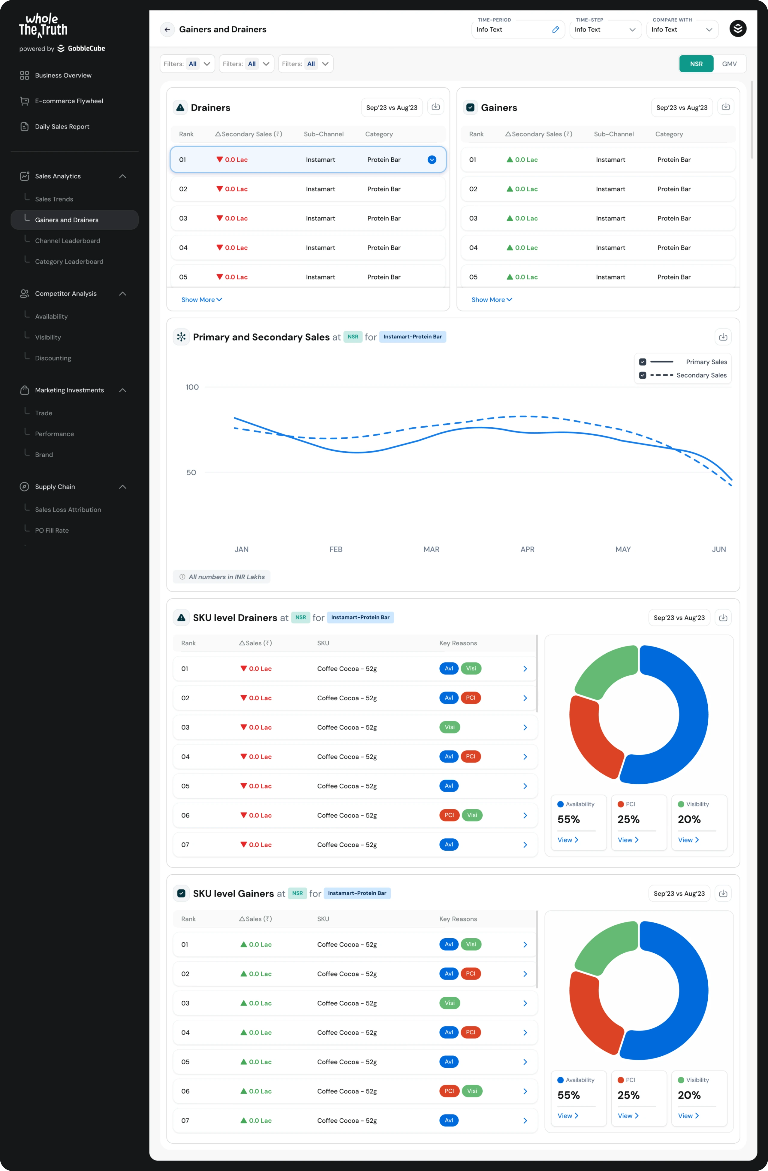
Our next attempt looked more like a conventional analytics product: charts, tables, cards, filters and summary metrics.Everything worked individually. Together, it still left the user with the same question:Where do I look first?
A user might need to compare a metric across city, category, SKU, marketplace and time period. The information was available, but finding the problem still meant moving through several views.
I started experimenting with a simpler comparison model.Rows represented metrics. Columns represented whatever dimension mattered to that business — a city, category, marketplace or something else. Each cell showed the current value and how it had changed.We called them Swimlanes. Below are the early swimlane iterations:
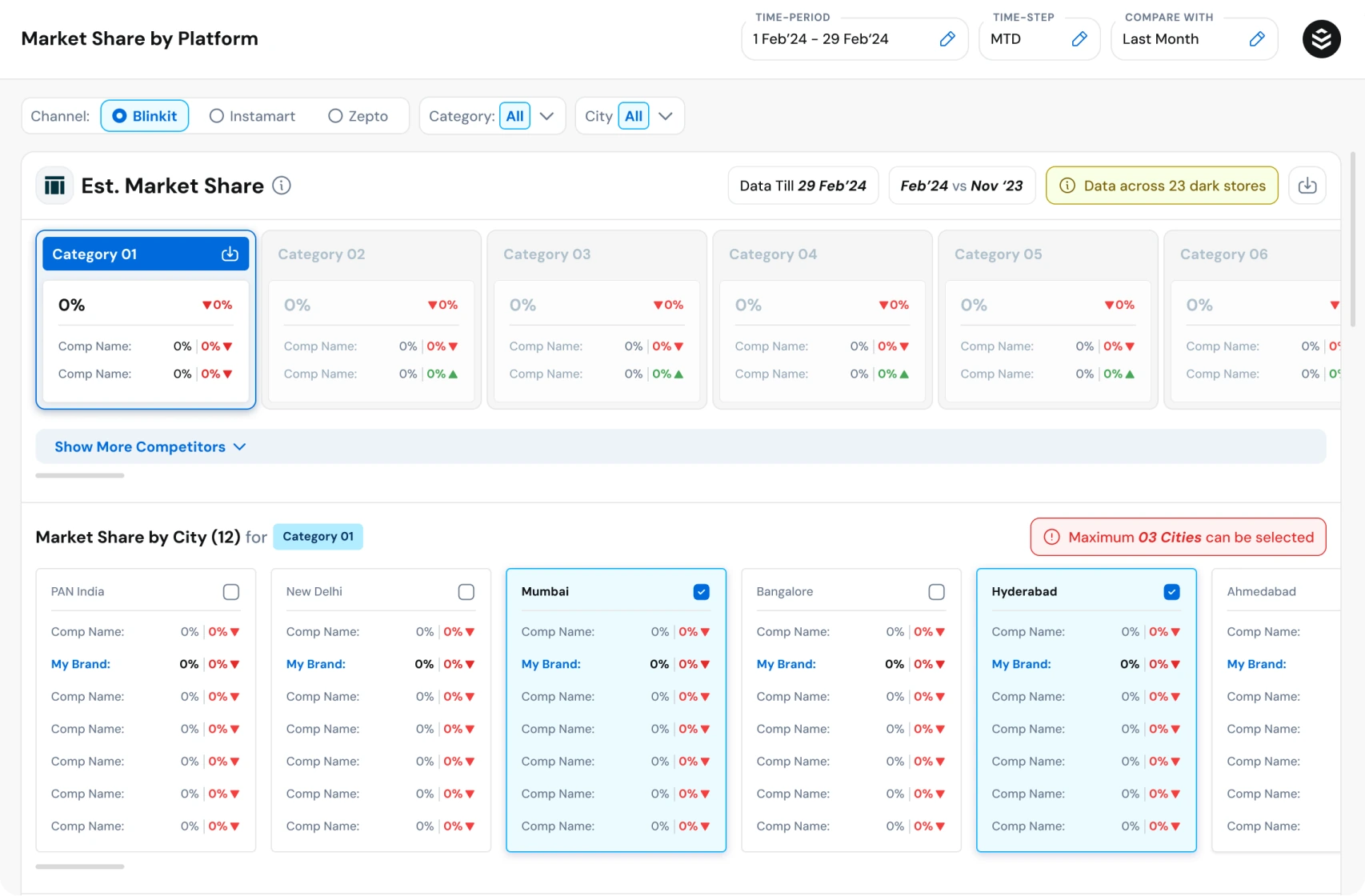
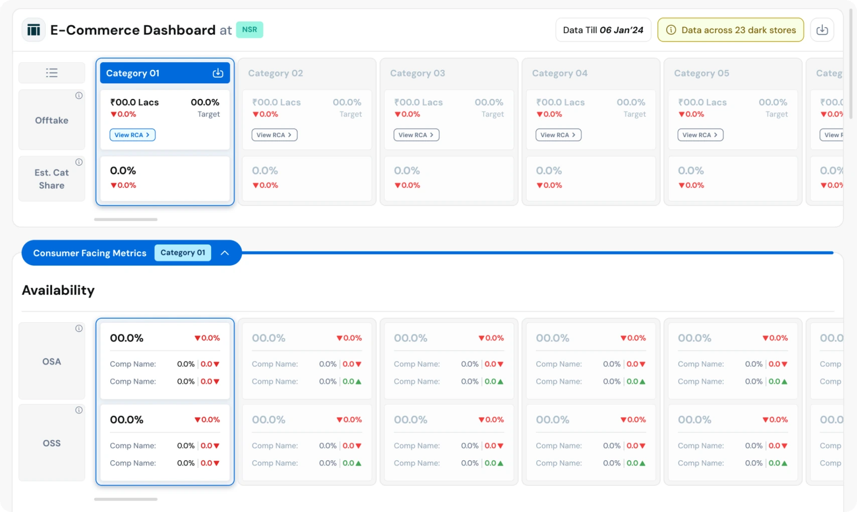
The important part wasn’t the component itself. It was the behaviour it encouraged.If Bangalore suddenly underperformed, the signal stood out immediately. From there, the user could narrow the problem:Bangalore → Category → SKU → Root causeBefore investing heavily in the UI, I tested a rough version with our early customers. They didn’t need us to explain how it worked. They simply started comparing.That was the signal.Swimlanes became one of the core mental models in GobbleCube and still exists three years later. Analysis that previously required hours of moving between spreadsheets could now begin in seconds.What swimlanes look like today and it’s behaviour -
As the product developed, we moved beyond showing metrics and started helping customers understand why something had changed and what they could do about it.That created two related design problems.First, some of the concepts were new. We couldn’t assume users already understood the language or the model. Onboarding wasn’t just “here’s where the feature is.” It also had to explain what this means and why you should care.So we used whatever format made the idea easiest to understand: product onboarding, formulas, explanatory UI, videos, illustrations, blogs and webinars.I even started making product videos because, sometimes, showing the idea was simply clearer than adding another tooltip beside a number.The principle was straightforward:If the data is difficult, the communication around it shouldn’t be.
As the core product started selling, we began exploring useful add-ons around it. One of those was strategic reports deeper analyses that helped customers answer bigger questions around growth, pricing, geography and product opportunities.The design goal was simple: make dense analysis understandable at a glance. Instead of turning reports into pages of charts and text, we used visual storytelling to make the key insight easier to grasp and remember. The visualisation followed the argument.After creating 100+ reports, repeatable patterns emerged across hierarchy, layouts and recommendation formats. We turned those into a system and later used AI to automate the repetitive parts — after the design thinking had already been established.
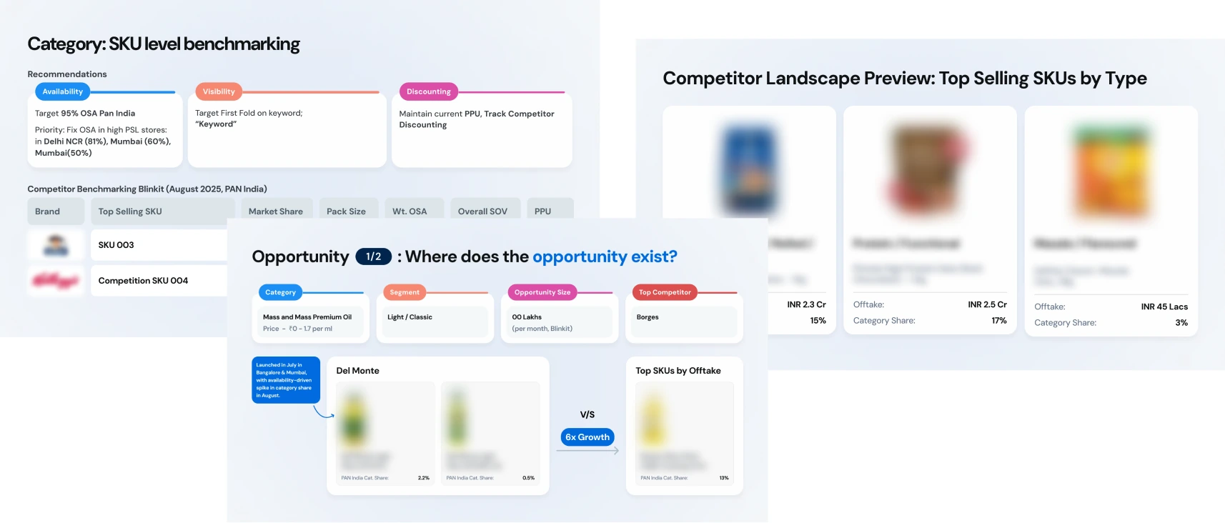
As the product and team grew, my focus shifted from designing every feature to creating the systems that helped others make better decisions.
- Built more data-informed product practices with analysts, looking beyond time spent to repeat usage, behaviour and decision-making patterns.
- Helped scale the design team from 2 to 6 designers, with shared patterns, documentation and review practices.
- Moved towards a broader role across product consistency, quality and cross-team direction.
The shift was essentially from designing screens to designing the conditions for good product decisions.
We eventually returned to chat through Gobbs IQ, but with far more context.Three years ago, users had to know what to ask. Today, GobbleCube already understands the brand, its performance, the page being viewed and the kinds of questions users ask.So chat can now surface insights proactively, help users investigate why, and answer questions that don’t need another dashboard.As AI moves closer to pricing, inventory and other business decisions, the design problem is increasingly about trust: what evidence to show, how to explain recommendations, and when a human should stay in control.
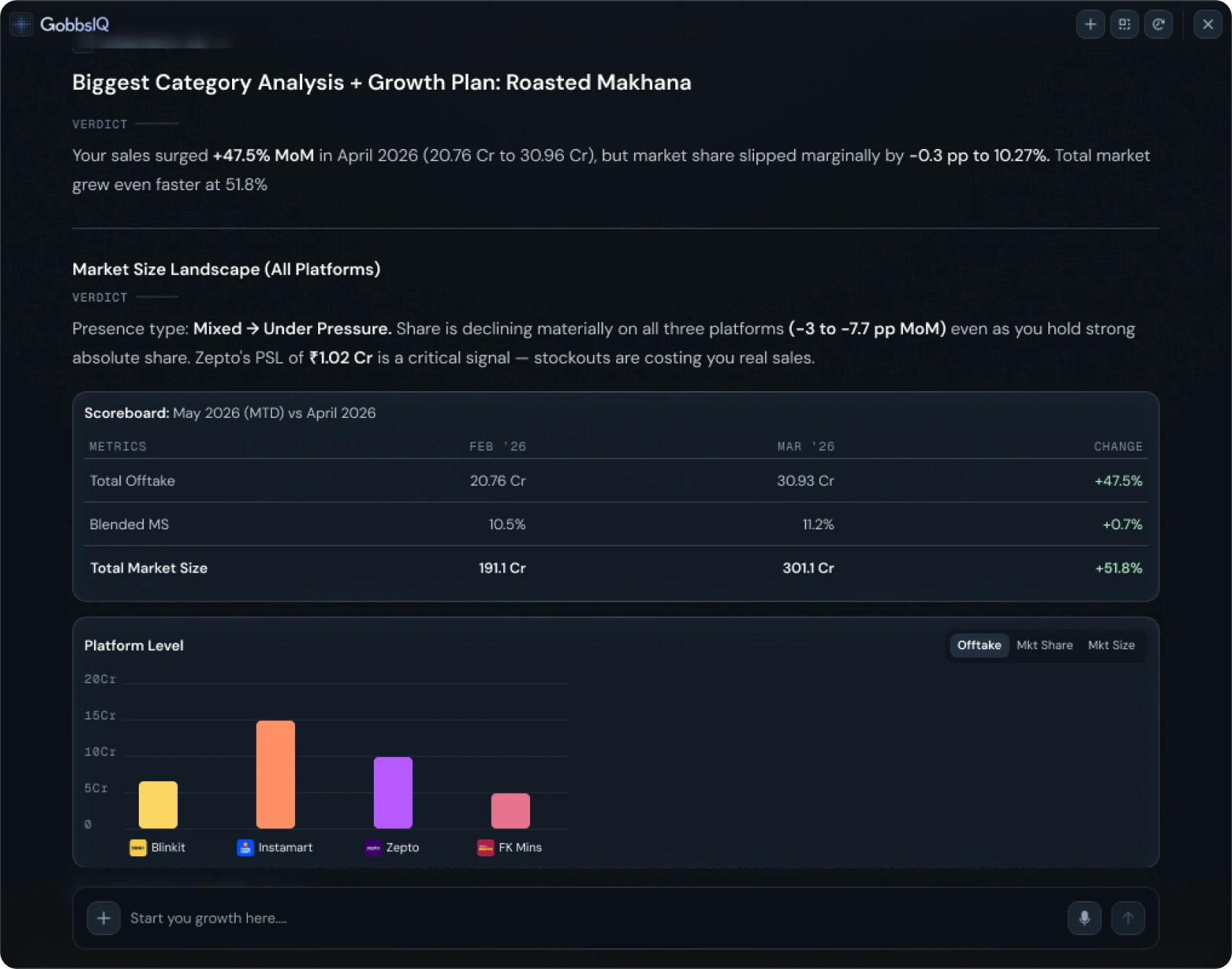
Over three years, GobbleCube grew from a focused analytics product into a much broader platform — with new modules, self-serve and PLG experiences, mobile, and AI-led products like Gobbs IQ.That scale has changed the design challenge too. Today, the harder problems are less about designing an individual feature and more about connecting experiences, managing complexity across different users, and making a growing product still feel like one coherent system.My role increasingly sits at that level: deciding what should stay consistent, what needs to evolve, and where design can simplify the product rather than add to it.